Creating Editable Chart Components in Figma…
…that don’t need to be detached!

Any designer who works on creating and maintaining design systems knows the pain of creating certain types of components, only to see another designer detaching them so they can be edited.
A great example of such components is charts. For a design systems designer, creating a chart component presents a choice between accepting that designers using the final component will have to detach it in order to edit the chart’s values, or, creating a series of parts that users will then put together to form the charts.
The former means that once the component is detached, there’s no guarantee it will end up looking as it’s supposed to.
The latter means having to create good examples and guidelines to allow users to assemble the final charts per the rules. And even then, there’s no guarantee users will follow these rules and guidelines.
In this article, I’ll show you one way (I’m sure there are others) to create bar and line chart components that can be edited without having to be detached.
It’s (Mostly) About Paddings
It is not possible to edit the layout of a component’s instance. This is by design and it makes sense because once a designer sets a component’s layout, they want it to remain consistent as the component is instantiated.
So, how can we create editable chart components that can show required values, without detaching them?
One answer is: We use paddings.
Bar Chart Components
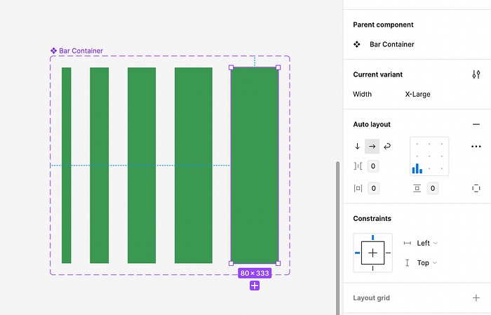
For bar charts, it is quite simple: each bar should be a shape inside an auto layout.
I usually define the bar containers as nested components. This gives me options to set things like variable bar widths, for example, but this isn’t a requirement.

The bar should have its ‘Vertical resizing’ property set to ‘Fill’ and the alignment of the auto layout container should be set to ‘bottom’ (left, right or centre, depending on your needs).

And that’s it! Now, to adjust the height of the bar, all a designer will need to do is adjust the top padding of the bar’s container.

Line Chart Components
Line charts are a little more complex, but not much.
We’ll need two separate auto layout containers.
One will be for the data point dots or markers. This container will contain a shape for the marker — let’s say this is a circle.

The circle will have fixed width and height. The container will have its alignment set to ‘bottom’, like in the bar chart case.
Also like in the bar chart, to adjust the position of the marker, all you need to do is adjust the bottom padding of the container.

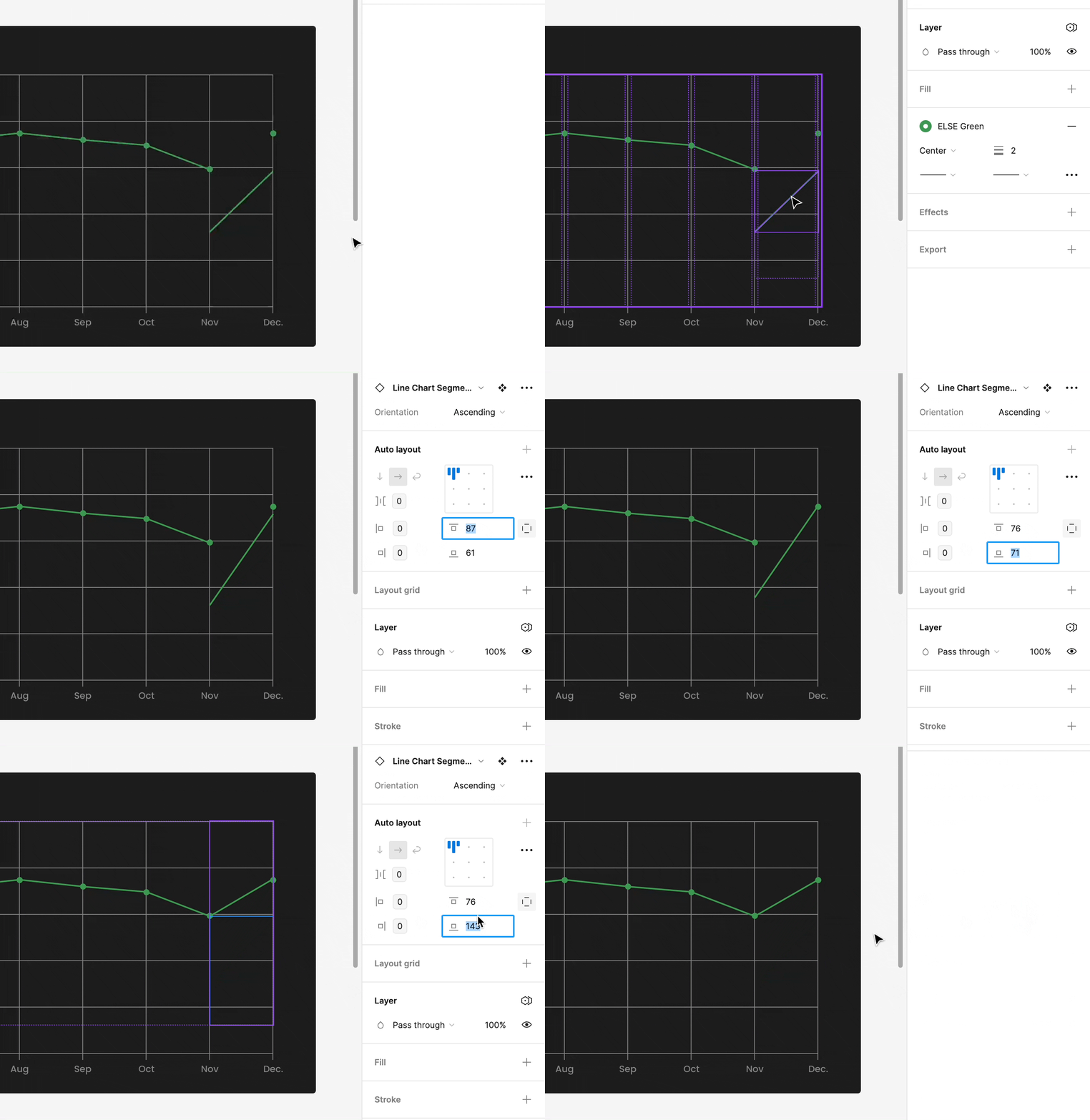
The second auto layout container we’ll need is for the line segments in between markers.
These will need to be nested components in order to set the segments as ascending segments or descending segments.
This will mean having (at least) 2 variants: one where the segment has a positive angle and one where it has a negative angle.

In both variants, the segment’s ‘Vertical resizing’ should be set to ‘Fill’ and the segment itself should start and end in opposing corners of the container.

And it’s done. To edit the segment you will now first select the correct orientation (ascending or descending) and then adjust the angle, by setting both the top and bottom paddings on the segment’s auto layout container.

You will need to adjust both the markers and segments in order to set the chart properly.

Other Chart Elements
Depending on how you build your chart components, there may be a need for other parts of them to be adjusted.
For example, you might need to adjust the position of labels.
This can be achieved using the same principle of adjusting paddings on a parent container.

And that’s one way of creating editable bar and line chart components in Figma. Hope you find it useful!
